
The Chrome web browser has a robust feature called Chrome Inspect Element, which lets users see and modify the HTML, CSS, and JavaScript that make up a webpage.
Developers, designers, and tech-savvy individuals use it to comprehend and change a webpage’s structure in real time.
By right-clicking on any element on a web page and selecting “Inspect” (or using the shortcut Ctrl+Shift+I on Windows or Command+Option+I on Mac), the Chrome Developer Tools open with the Inspect Element panel.
The panel delves into the page’s code, showing the document’s structure (DOM), applied styles, network activity, and more.
Users can experiment with design changes by modifying the CSS or HTML directly in the browser without permanently affecting the page.
It helps debug and test responsive design and make quick front-end changes before applying them to the live site.
Inspect Element is not only valuable for web developers but also for learning about web development.
Interacting with real-world examples allows beginners to explore how websites are built. This versatile feature enhances development workflows and the user’s understanding of web technology functions.
Chrome Inspect Element Mobile Scenarios
Scenario 1: If you are a developer working on a project where a client wants you to make a website for his business that is fully responsive for desktops, tablets, and especially for Mobile with different viewports.
Scenario 2: If you are a tester working on the same project and the developer assigns the ticket to the QA team, the tester needs to check the response of the implemented website on different mobile screens.
Website Response across a range of Mobile Devices and various platforms plays a significant role in delivering a superior user experience.
However, Mobile Responsive Check and debugging can get messed up, particularly when there are mistakes in code, browser inconsistencies, web page load efficiency, or device incompatibility.
We need to resolve all these issues as soon as possible. To simplify debugging your web application, utilize Developer Tools or debugging options like Chrome inspect element shortcut.
Sometimes, we can see the responsive issue on the actual mobile device while inspecting the Android element, but we cannot reproduce that issue with the Chrome inspect tool.
How Can We Reproduce that Issue and Debug It Using Chrome Inspect Devices?
Right here, we’ll discuss the most trending method: the Google Chrome Inspect Element mobile tool, which allows us to debug on Real Devices.
Follow these steps to inspect elements on the Mobile Device:
1. The very first step is to Enable USB Debugging on your mobile phone.
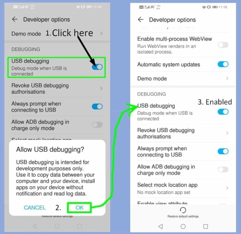
2. After enabling USB Debugging, connect the mobile device to the PC or Laptop.
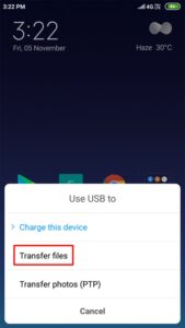
3. Now, select the Transfer files option in USB preference.
4. Open any website on your mobile browser.
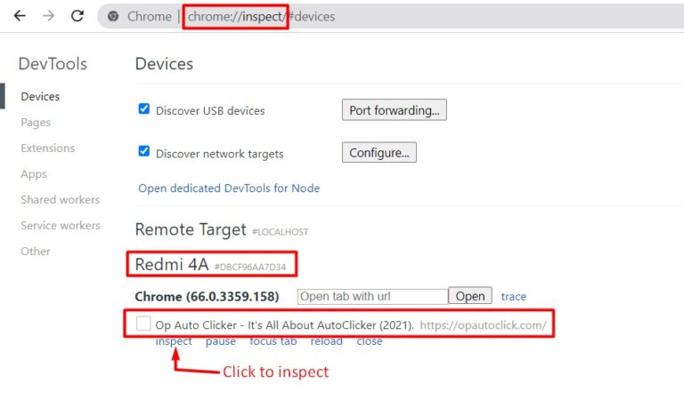
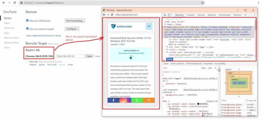
5. On your laptop or PC, open Chrome, type chrome://inspect, and hit enter.
6. Under Remote Target, you can see the website you opened in your mobile browser. Just click on inspect to debug the website.
Final Thoughts
You may test and debug the functions in a virtual environment using Chrome Inspect Element Mobile, a responsive testing simulator, just as you would on an actual device. Additionally, you may test webpages across various screen sizes and on mobile devices online. Using a simulator, testing responsive designs for several devices is simple.
Frequently Asked Questions
Question 1: What is the key to inspecting elements in Chrome?
Answer: The key combination to open the Inspect Element tool in Chrome is Ctrl + Shift + I on Windows or Command + Option + I on Mac. You can also press F12 as a shortcut to access the Chrome Developer Tools directly.
Question 2: What is the inspect mode in Chrome?
Inspect mode in Chrome is a feature within Chrome Developer Tools that allows you to inspect and interact with a webpage’s HTML, CSS, and JavaScript. It provides a detailed view of the page’s structure, including the ability to modify the code in real-time. This mode is often used for debugging, testing design changes, and analyzing a webpage’s behavior.
Question 3: How do I open Inspector in Chrome?
To open the Inspector in Chrome, right-click on any element on the web page and select Inspect from the context menu. Alternatively, you can use the keyboard shortcut Ctrl + Shift + I on Windows or Command + Option + Mac to open the Inspector directly.
Share