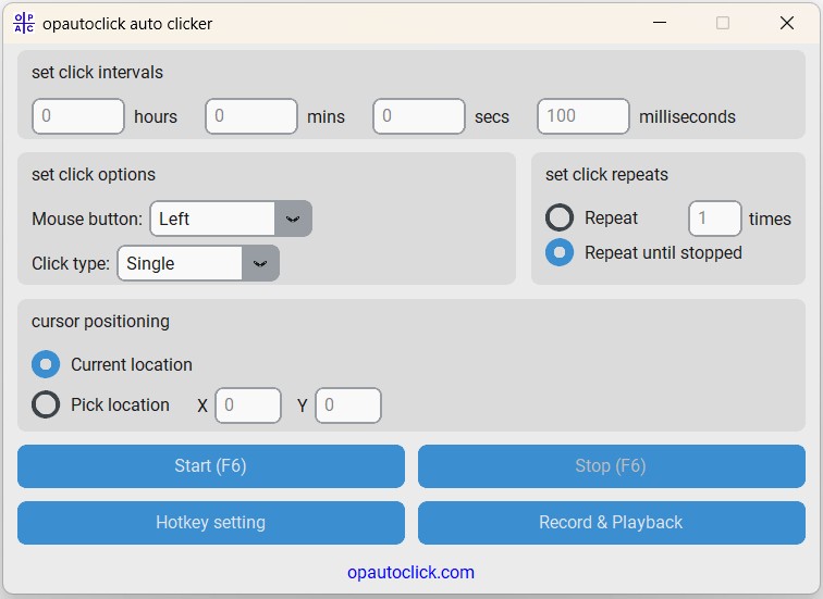
Auto Clicker Main Interface
Window Overview
Clean, Professional Design
The application features a fixed-size window (600×405 pixels) with a modern, light theme designed for clarity and ease of use. Every control is strategically positioned for efficient workflow.
Interface Sections
📊 Click Intervals Section
Location: Top section
Purpose: Configure timing between clicks using hours, minutes, seconds, and milliseconds
Controls: Four input fields with clear labels
🖱️ Click Options Section
Location: Left middle section
Purpose: Select mouse button and click type
Controls: Dropdown menus for button and type selection
🔄 Click Repeats Section
Location: Right middle section
Purpose: Set how many times to click or run continuously
Controls: Radio buttons and numeric input
🎯 Cursor Positioning Section
Location: Lower middle section
Purpose: Choose click location method
Controls: Radio buttons and coordinate inputs
🎮 Control Buttons Section
Location: Bottom section
Purpose: Start/stop automation and access features
Controls: Large, clearly labeled action buttons
🌐 Website Link
Location: Very bottom
Purpose: Link to official website/support
Controls: Clickable website link
Control Details
Input Fields
- Placeholder Text: Shows default values and expected input format
- Validation: Automatic validation prevents invalid entries
- Clear Labels: Each field clearly labeled with its time unit
- Keyboard Navigation: Tab between fields for efficient data entry
Dropdown Menus
- Mouse Button: Left, Right, Middle options with clear icons
- Click Type: Single or Double click with behavior descriptions
- Default Selections: Pre-set to most common use cases
Action Buttons
- Start Button: Large, prominent button with hotkey display
- Stop Button: Disabled until clicking starts, then becomes primary control
- Hotkey Setting: Opens dialog for customizing keyboard shortcuts
- Record & Playback: Access to advanced automation features
Visual Design Elements
🎨 Design Philosophy
The interface uses a light theme with blue accents for optimal readability and professional appearance. Colors and spacing are designed to reduce eye strain during extended use.
Color Scheme
- Primary Background: Clean white for main content areas
- Section Backgrounds: Light gray for visual separation
- Accent Color: Professional blue for buttons and highlights
- Text Colors: Dark gray and black for optimal readability
Typography & Spacing
- Font Family: System fonts (Arial, Segoe UI) for consistency
- Font Sizes: Hierarchical sizing for clear information structure
- Spacing: Generous padding and margins for comfortable interaction
- Alignment: Left-aligned text with centered controls for balance
Accessibility Features
♿ Built-in Accessibility
- High contrast text and backgrounds
- Large, easily clickable buttons
- Clear visual hierarchy
- Keyboard navigation support
🔤 Text & Visual
- Readable font sizes throughout
- Clear section divisions
- Consistent button styling
- Logical tab order for navigation